|
In the end I am happy with my website and the amount of work I have done, Photoshop is a lot harder than I first thought. it took a lot longer to do what I thought I could do in maybe a week, and its frustrating. Overall I like what ive been able to accomplish
FERNARICIOZ WEBSITE AND CLOTHING LINE
1, the fernaricioz ava clothing line will be an arrangement of nice looking, modern clothes with a target demographic of 16-30 2 I found inspiration in the project because me and a long time buddy of mine have always wanted to launch a clothing line, or atleast feel like we did, the name is a cross between two last names, ava means always above average, and the lifted tag has been something ive been doing for a very long time 3. more than likely I will use: photoshop, weebly,chrome,and word. 4. I will use my project planning skills and make sure I have a good idea, then I will use my drawing skills for the logos. 5. I will need to learn how too, put lettering on clothing and warp it, how to change the colour of an object and making it not look fake, how to make a realistic label. 6.by helping me when I get stumped and need a new idea or fresh set of tracks to go off of. 7. the easy part is getting the name, I already have a company name. the hard part however will be putting my ideas from in my head to photoshop using the mouse, I am a lot better with a pencil but will over come these challenges 2019-01-15/16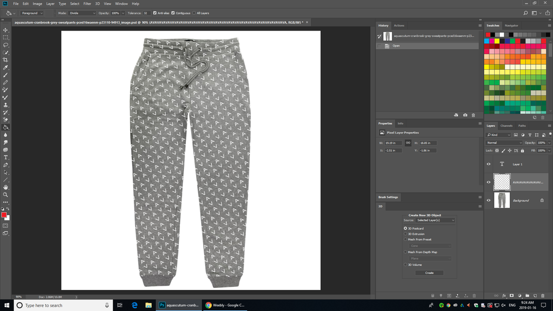 these pants took way longer than expected and was a difficult feat. i could not get the text the way i envisioned it but with the tools i could find and use i did what i could, did not upload yesterday because was not done, started on it again today and this is the outcome. i am happy with the way it looks and i like the way the strings are not covered with letters.
LIFTED WHITE/COPPER TEE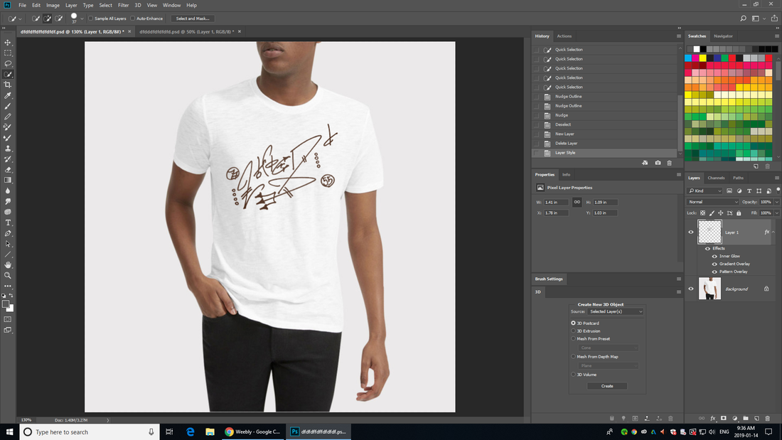 FINALLY FIGURED OUT HOW TO MOVE AND PLACE LOGO ONTO CLOTHING, AM HAPPY WITH DESIGN BUT WOULD LIKE TO REFINE IT MORE, I DO NOT LIKE THE WAY IT SITS ON THE SHIRT EVEN THO I HAVE WARPED IMAGE TO FLOW WITH THE SHIRT,
 scanned labels and put into computer but cannot figure out how to resize it and make it black
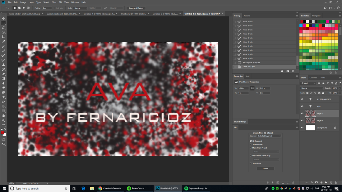 AM VERY HAPPY WITH HOW THE CLOTHING CARDS CAME OUT HOWEVER I MIGHT DO A HIGHER RESOLUTION CLONE   will be putting "always above average" on sleeves hence the AVA (AAA) LOGO
COULD NOT FIGURE OUT HOW TO POST ON WEBSITE SO JUST SCREENSHOTTED IT 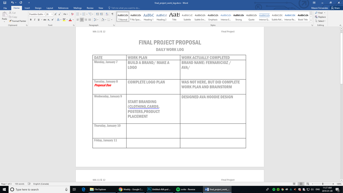 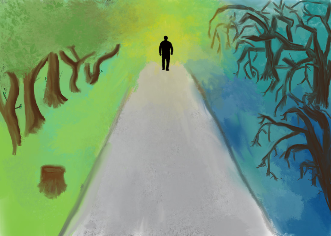 My artwork depicts a lone man walking on a road hanging within the balance of positive and negative, good and evil, excitement and disappointment. It can be perceived in so many ways. He is walking to a yellow light which symbolizes the future, if he veers of left he may find himself doing very well for himself but if he veers right there is no telling what could happen. Its his job to pick which side of the road to walk on.
I created my artwork with Photoshop, I used a variety of different paint brushes and spray cans, the final effect does depict what my intensions for the painting were, but with a little more experience I could do even better. The artwork I have produced reflects the balance of positive and negative through out life and we must “walk” through it all, we mustn’t get caught up in the negative or boast and strive on our positives, like if a journey that has ups and downs and its your job to hold on for the ride. A couple goals for my art work was to get away from using regular brushes and start using more blend-able and mixer brushes, the effect looks a lot better than anything I could do with regular paint brushes another goal I had was to take my time and not rush the artwork, this I did as well. My overall thoughts on my piece are not great, I wish it would have turned out better, but time is the only way to fix it, I do however like the painting and was really my first painting with “meaning” or a story behind it. |
AuthorWrite something about yourself. No need to be fancy, just an overview. Archives
January 2019
Categories |
 RSS Feed
